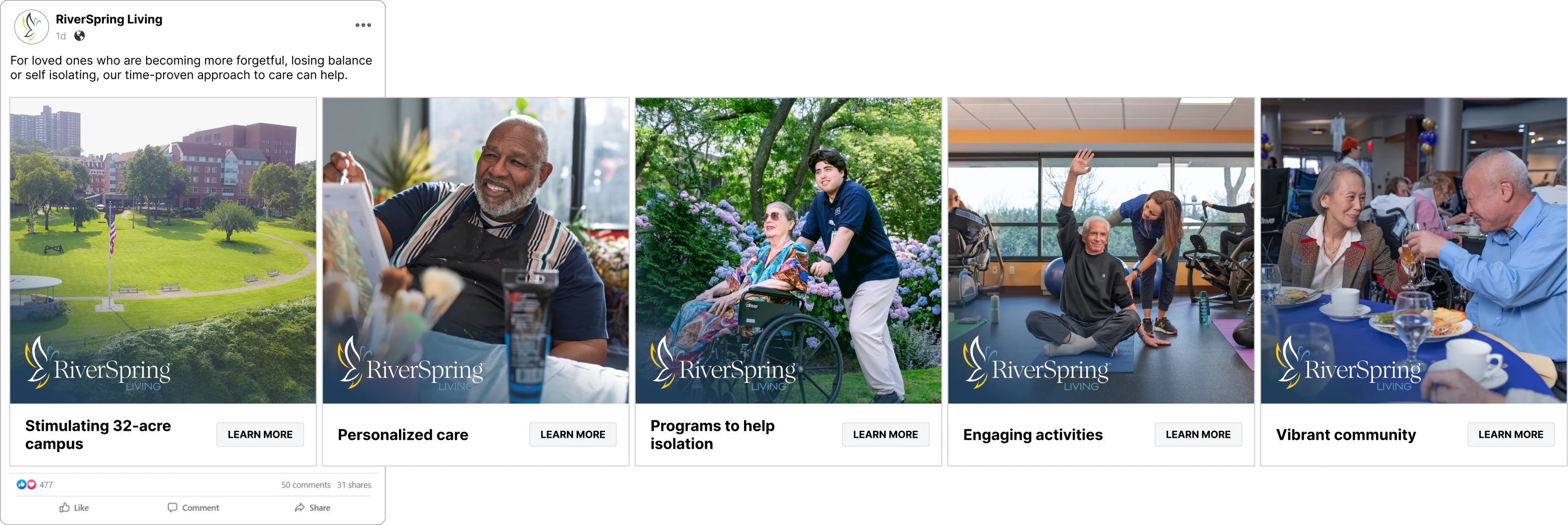

THE RIVERSPRING LIVING DIFFERENCE
The Mission
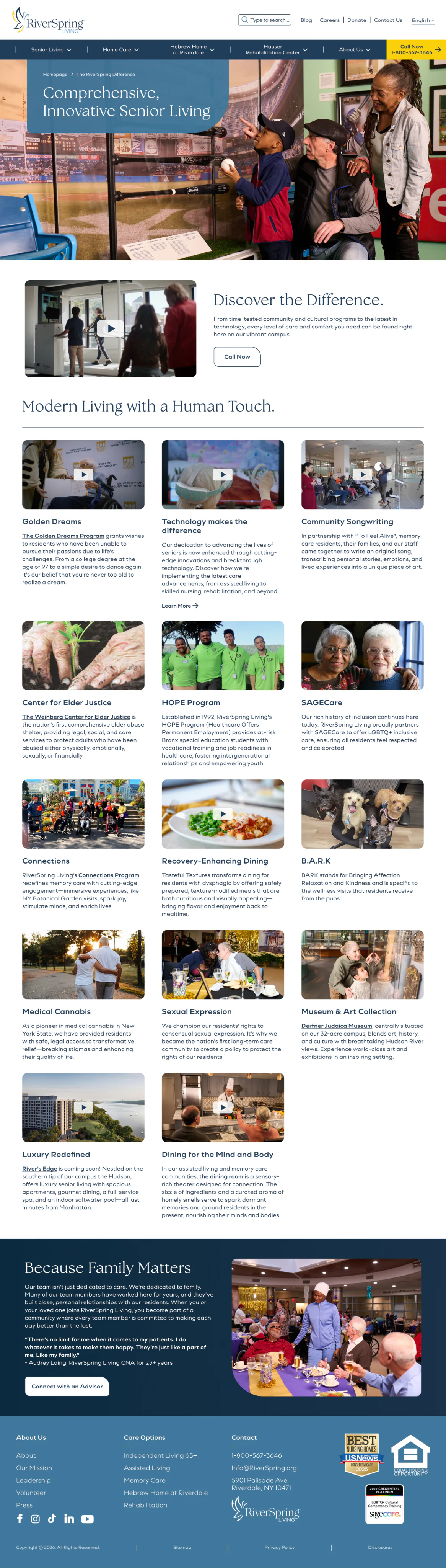
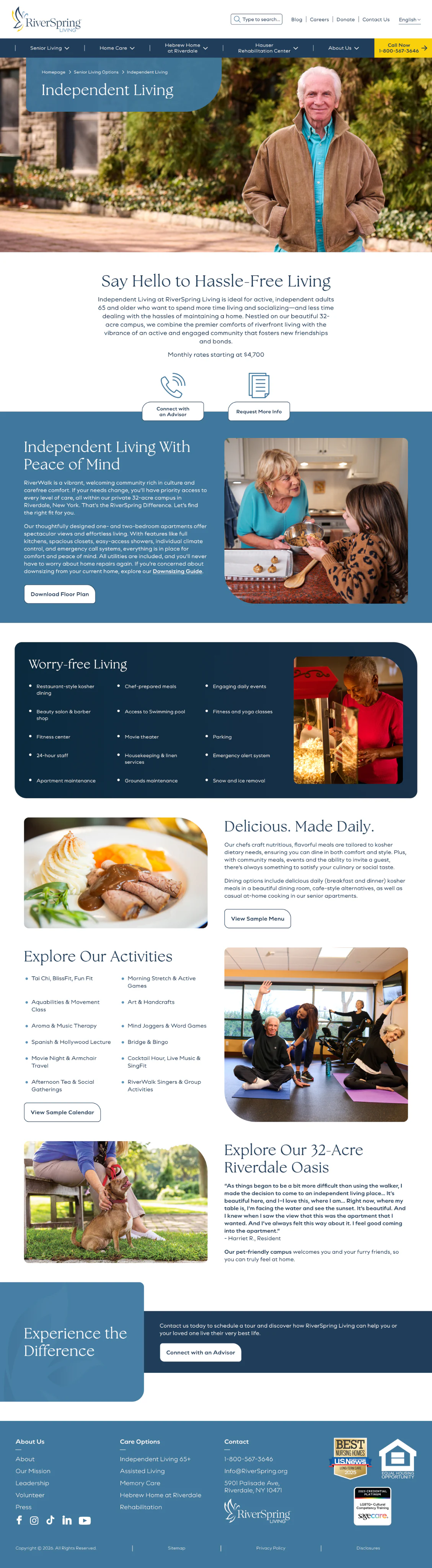
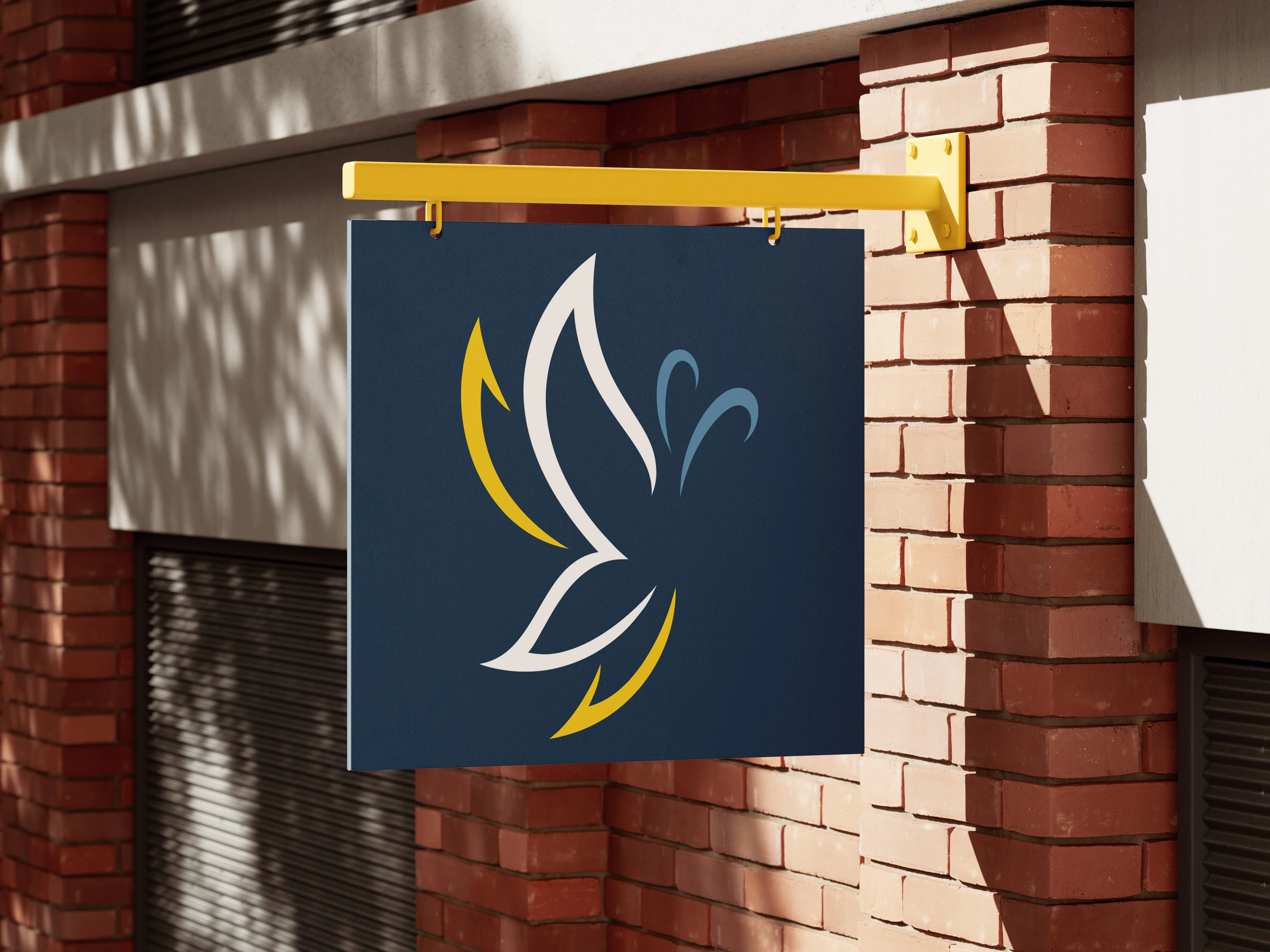
RiverSpring Living has earned a reputation as one of New York’s most respected senior living and healthcare organizations, but its brand no longer reflected the sophistication of its care, innovation, or leadership in technology. They needed a complete transformation that unified their visual identity and internal culture and clearly communicated the advanced clinical technology and care that set them apart in an increasingly competitive category.
The Solution
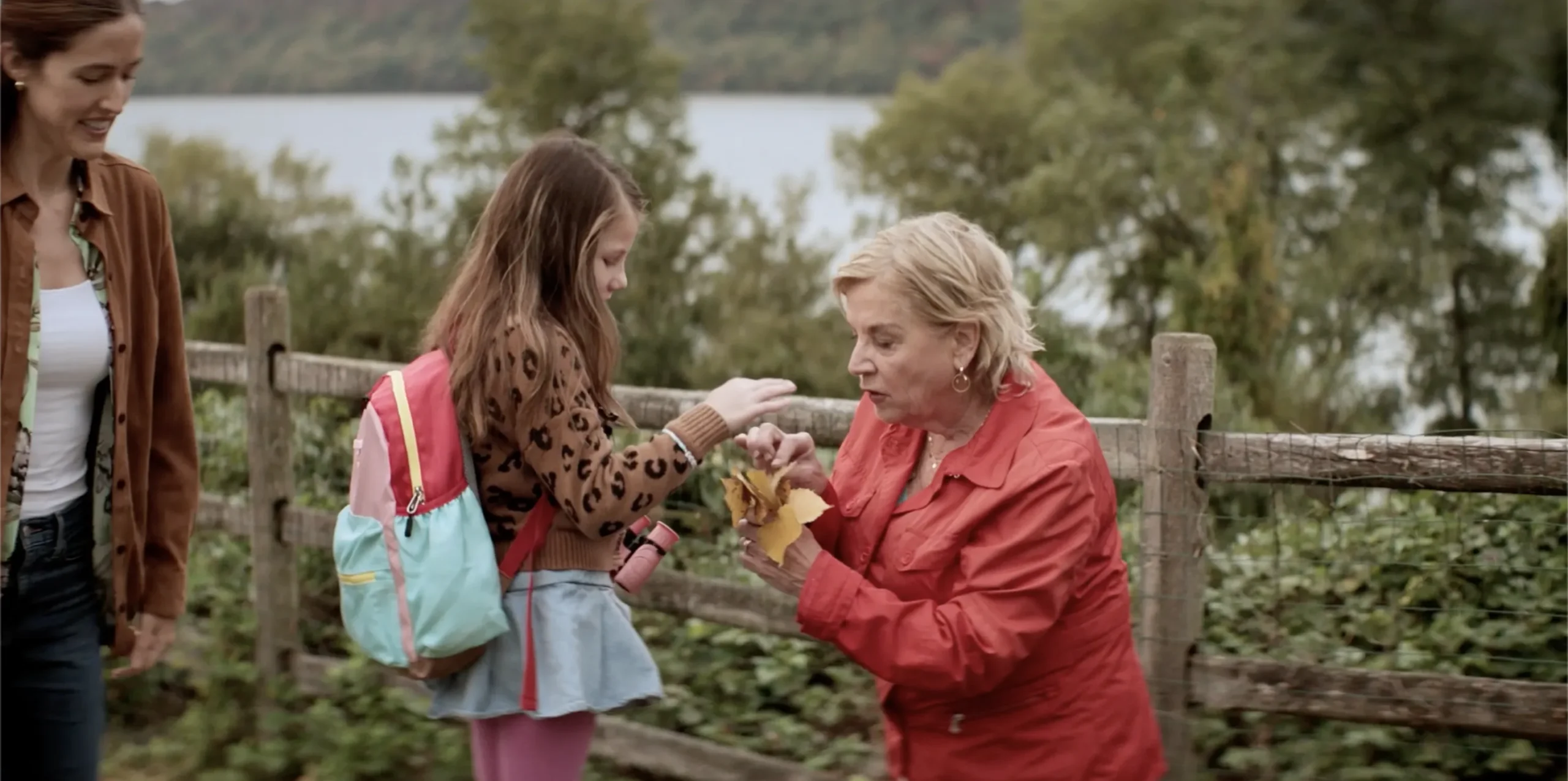
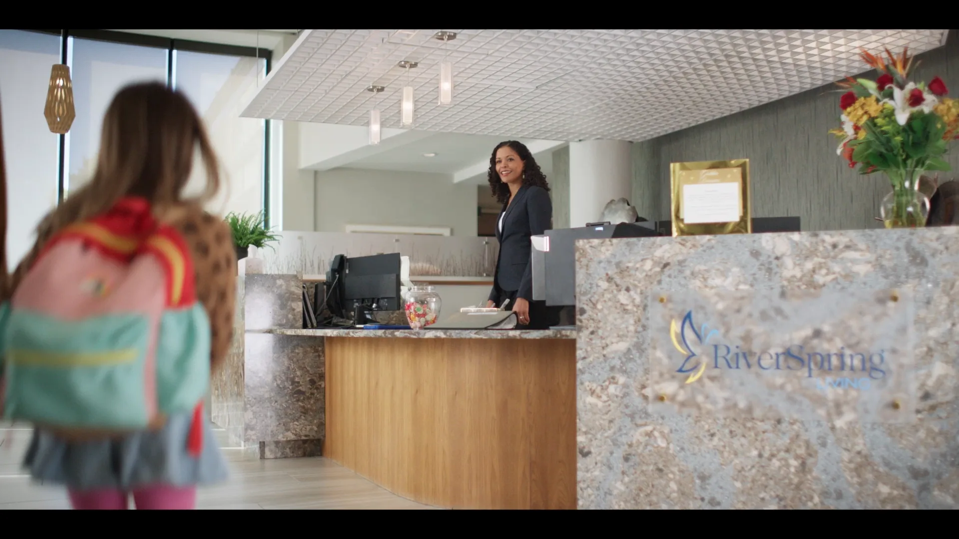
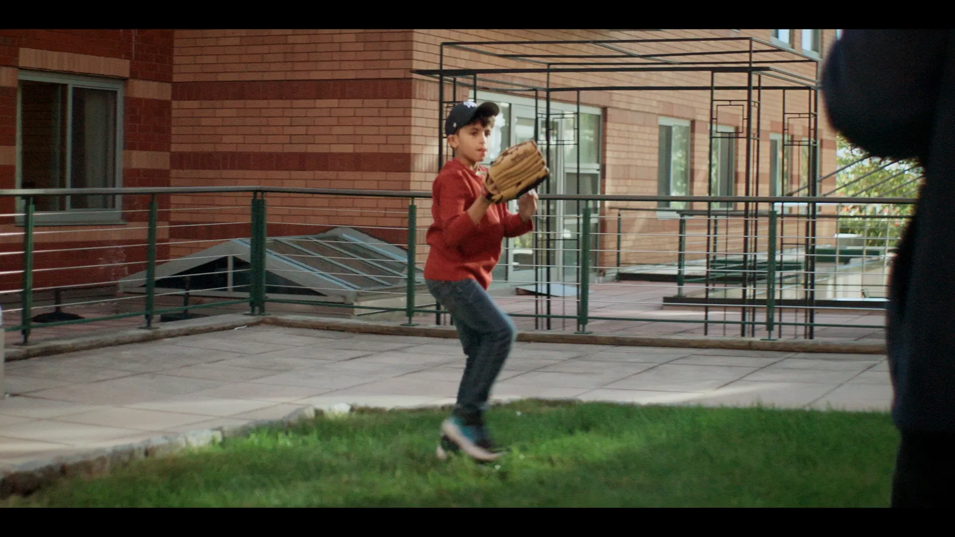
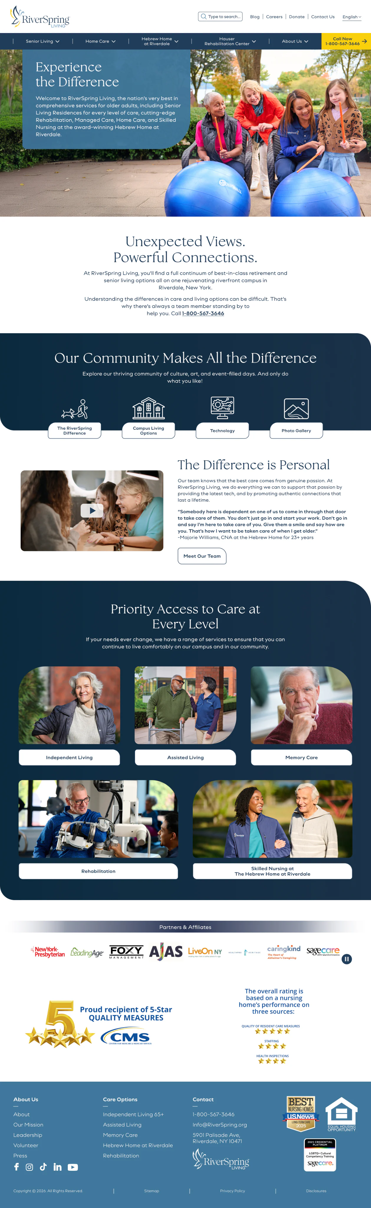
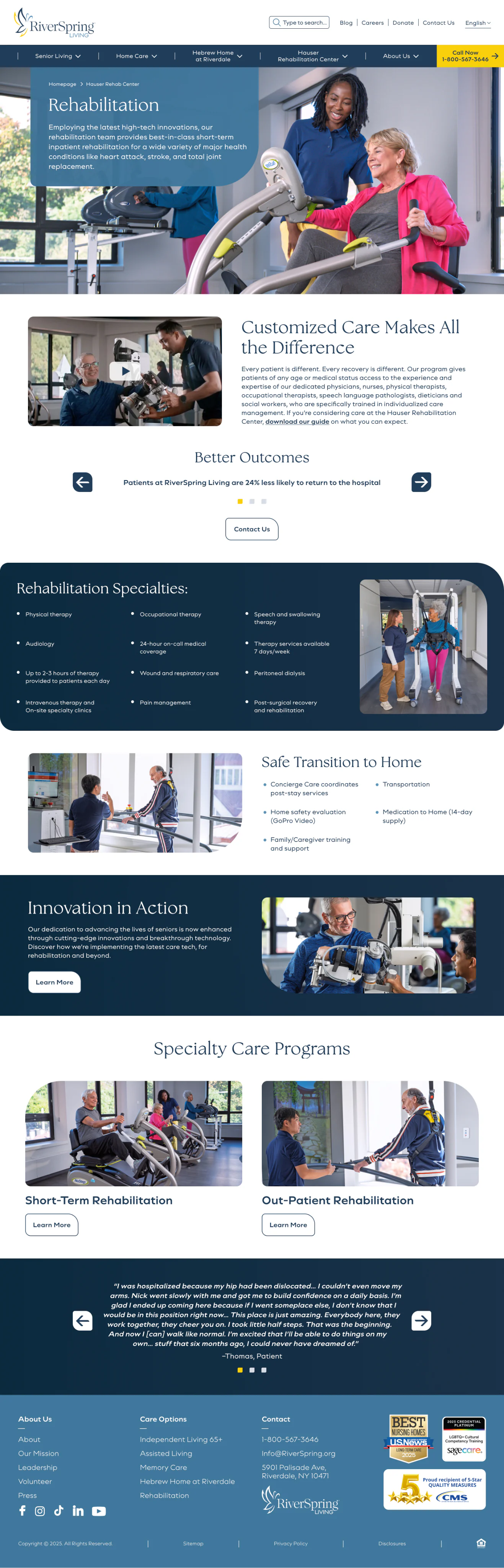
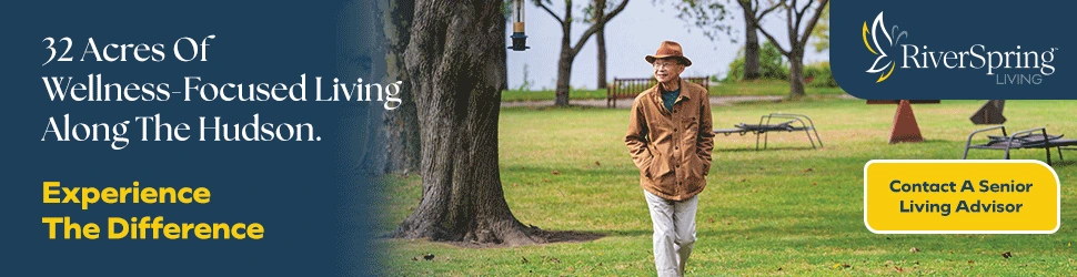
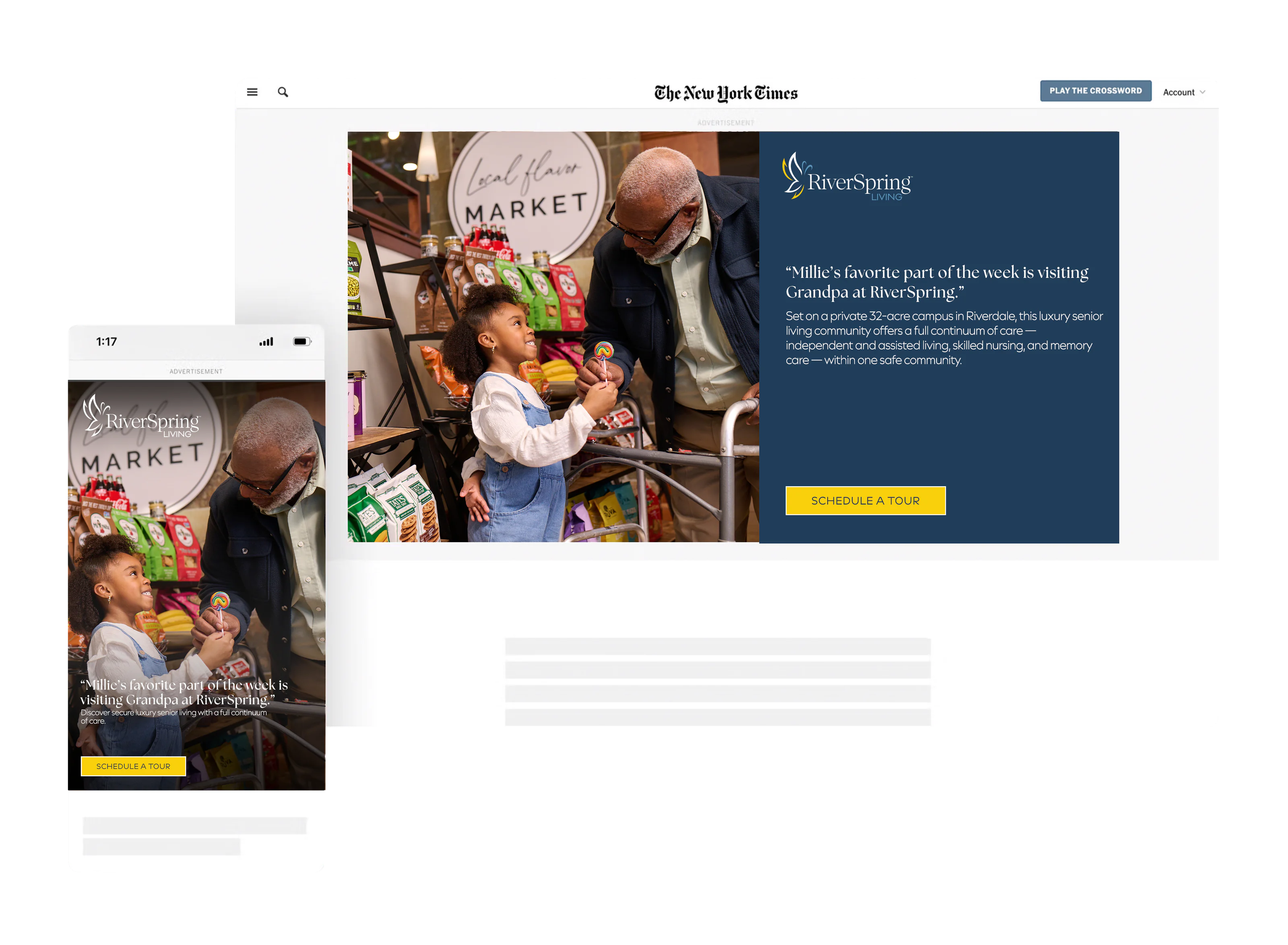
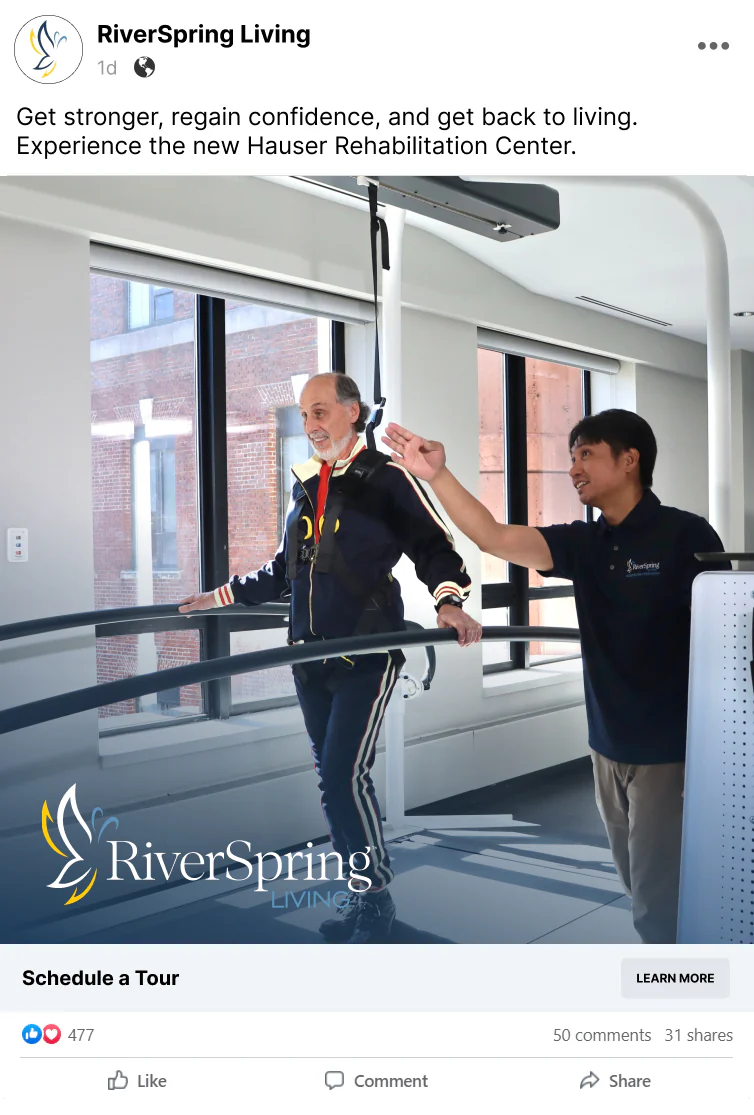
Instead of telling audiences what made RiverSpring different, we invited them to experience it through the eyes of a child—a distinctive storytelling perspective that brought warmth, wonder, and humanity to every interaction. Paired with a renewed emphasis on RiverSpring’s industry-leading rehabilitation technology and innovation, the campaign and new site generated a 300% increase in engagement and a 900% increase in conversion rate.
What we did
STRATEGY/IDENTITY
BRAND REDESIGN/TOOLKIT
ALL CHANNEL CREATIVE
SITE DESIGN/SEO/AEO
PRODUCTION
MEDIA PLANNING
MEDIA BUYING